Fedra Sans Armenian: Type Design
Company: Typotheque Type Foundry, Holland
Co-Author: Peter Bil’ak
2009
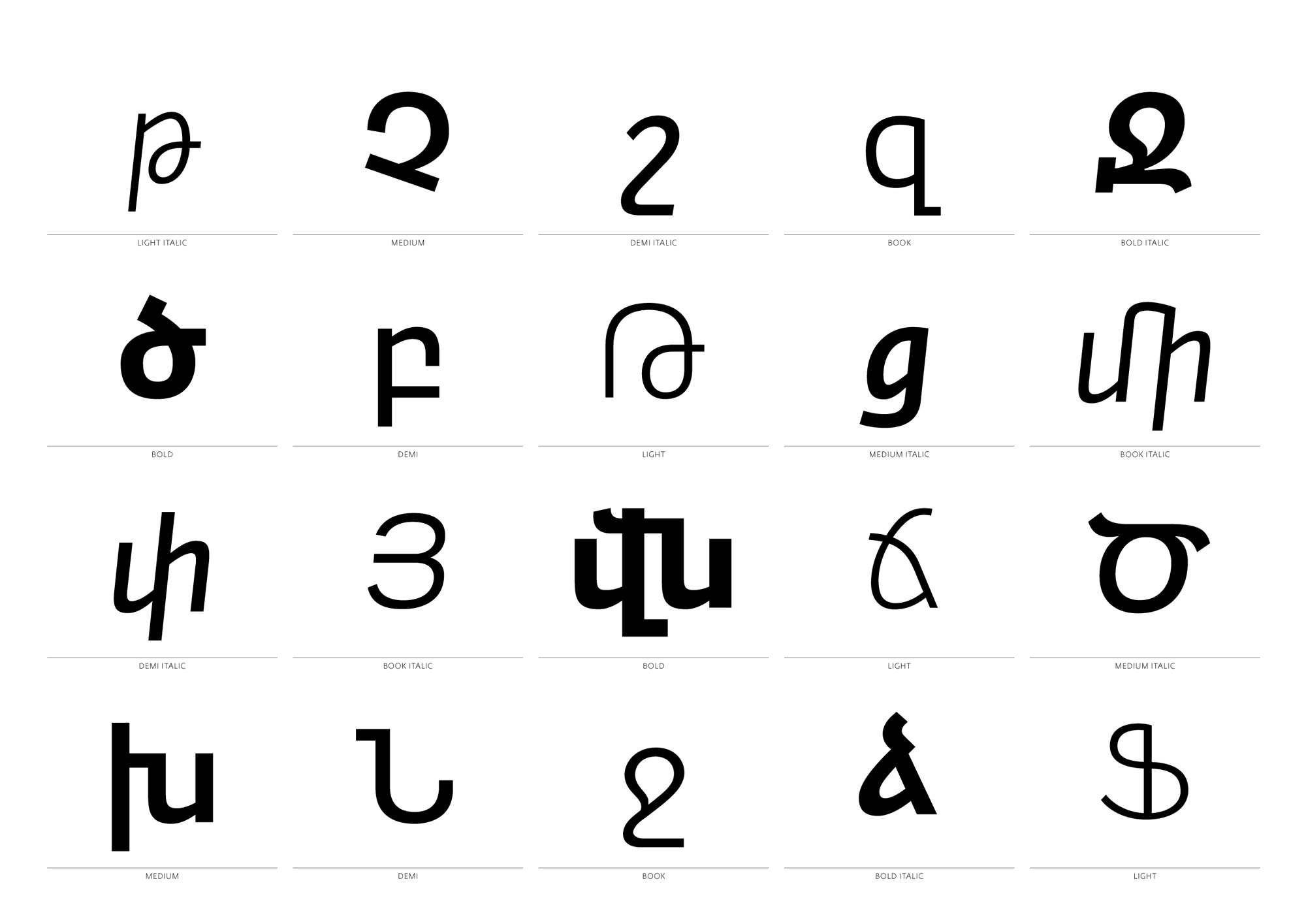
Fedra Sans Armenian applies the basic design principles of the Fedra font family to the Armenian alphabet, making it suitable for use both in text and display typography.
The font family has 5 widths and true italics. All typefaces are available for desktop use and as web fonts.

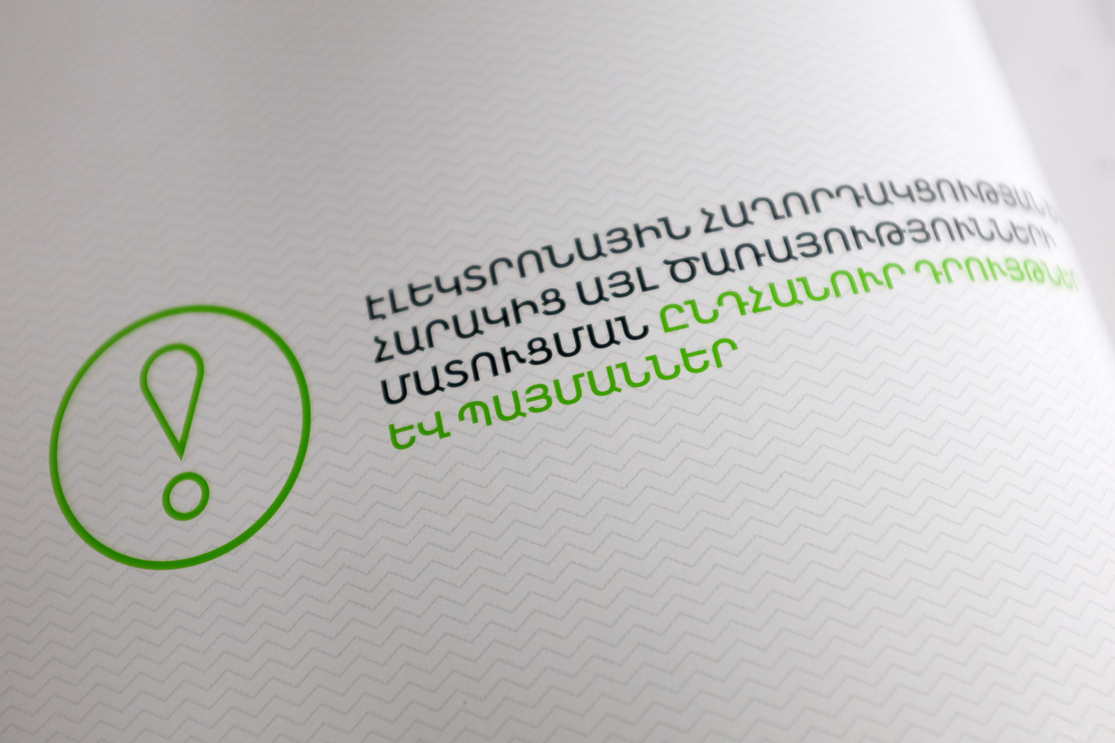
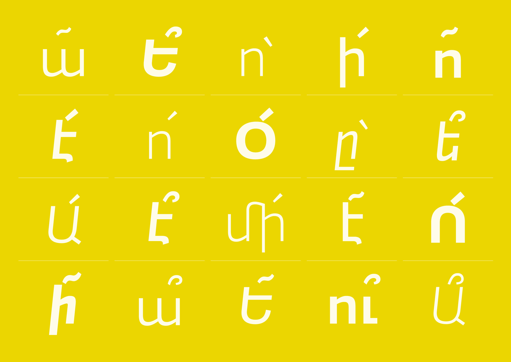
Fedra Sans Armenian includes the necessary ligatures and uses open type features and advanced ligatures for the proper presentation of punctuation characters. (Other than in Latin, the marks appear in Armenian in the middle of a word).
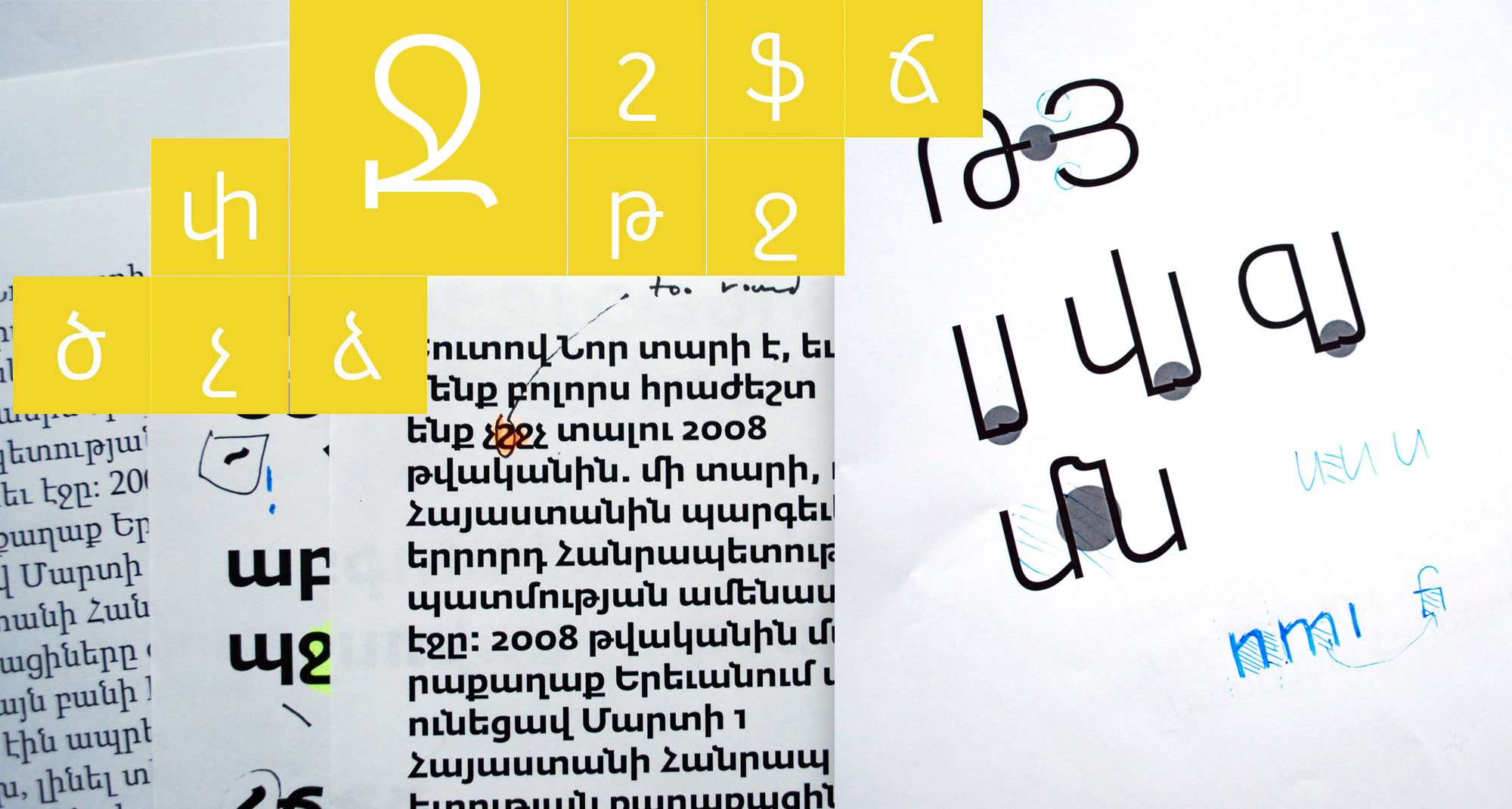
The vertical proportions of the Armenian alphabet are not identical to Latin. The readability of Armenian glyphs is based on ascenders and descenders and not on the x-height. Thus, the definitions for the vertical metrics for the Armenian set was challenging, given the distinctive large h-height of Fedra Sans.
Download PDF Specimen
Fedra Sans Armenian won the Bronze at Granshan 2010 International Type Design Competition

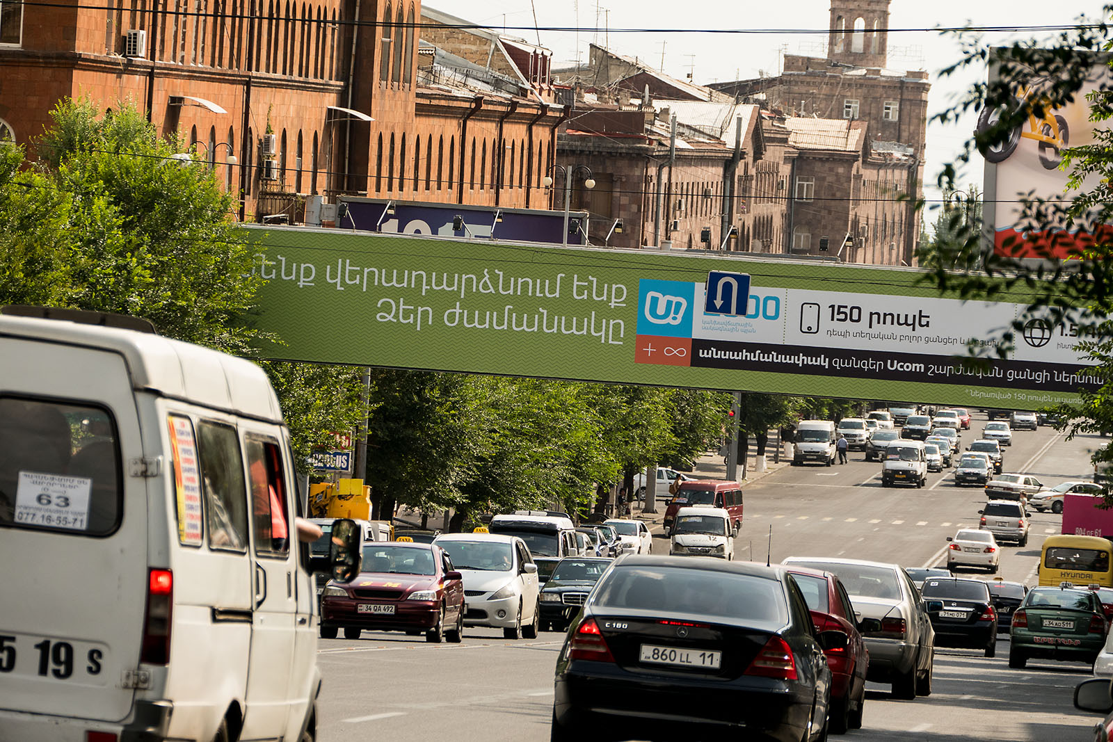
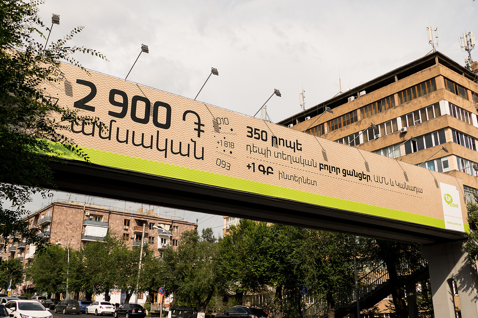
It is a very special feeling, coming back home. In June of 2016, I had just arrived in Yerevan after a 30-hour journey from Darjeeling and 6 months of traveling around the world. Simultaneously excited and exhausted, I used the few minutes in the cab on my way from the airport to look around at how the city had evolved.
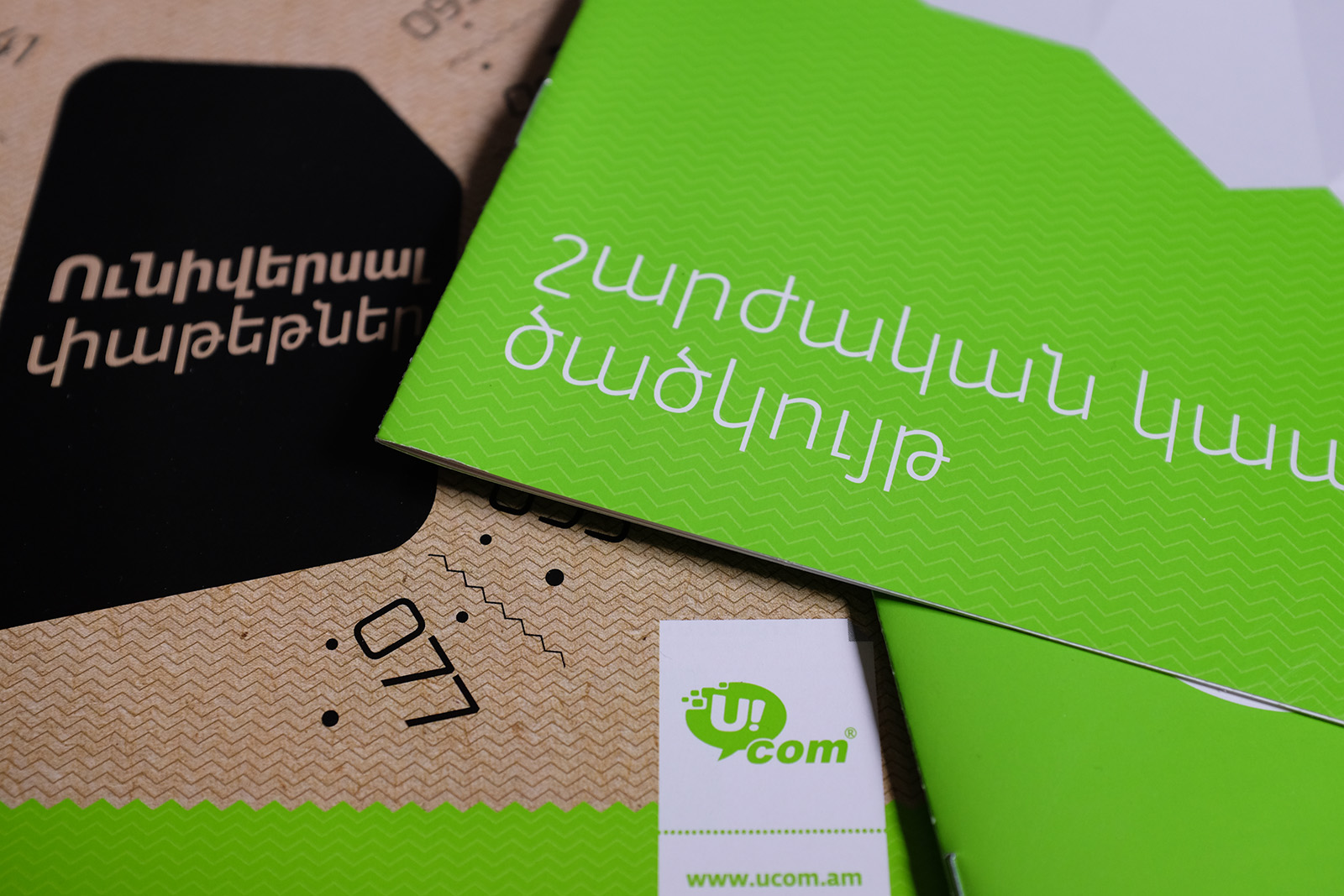
“Finally some decent typography!” I thought to myself, reading the huge Ucom billboards along the highway.
Then I spotted more ads from Ucom, a large-scale (perhaps even the leading) communication company in Armenia. Something was strange about the font… something familiar… it was my font.